19 Mar
While many developers possess a solid understanding of the basics of CSS, the realm of CSS is vast and continuously evolving, offering a plethora of lesser-known techniques waiting to be discovered. These techniques, often overlooked, have the potential to elevate your projects to new heights, infusing them with depth, creativity, and a touch of sophistication. In this blog post, we embark on a journey to explore some of these CSS pro tips, unveiling hidden gems that can breathe life into your designs. Beyond the confines of conventional CSS styling, we delve into the realm of innovation, encouraging you to think beyond the ordinary and experiment with unconventional approaches.
From intricate animations to dynamic layouts, from subtle transitions to mesmerizing effects, our exploration spans a wide spectrum of possibilities. We unravel the secrets behind creating fluid and responsive designs that captivate the imagination and engage the senses. By delving into these advanced CSS techniques, you’ll discover the power to transform static elements into dynamic visual experiences. Each tip serves as a catalyst for creativity, empowering you to push the boundaries of traditional CSS styling and unlock new avenues for expression.
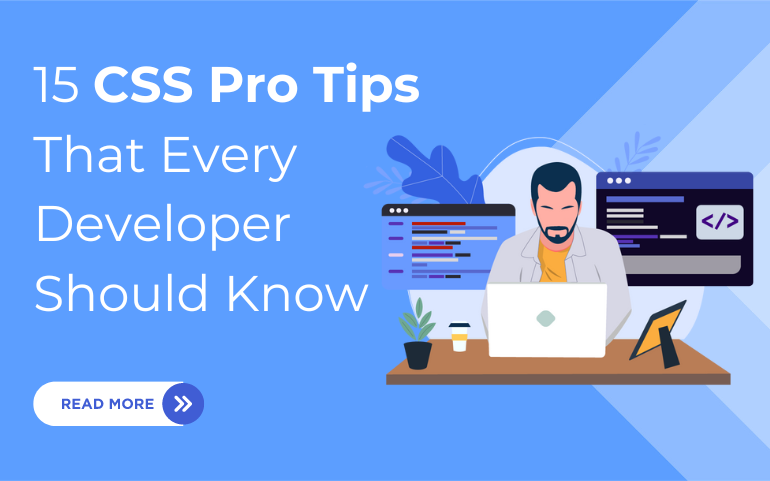
15 CSS Pro Tips for Developers To Excel CSS
1. Create Custom Checkbox and Radio Inputs:
Customizing checkboxes and radio inputs allows you to tailor them to your website’s design aesthetic. By hiding the default input elements and styling their labels using CSS, you can create visually appealing input controls that enhance user experience and maintain visual consistency across your site. Customizing the appearance of checkboxes and radio inputs can improve user experience and visual consistency. Here’s how you can achieve it:
/* Hide default input */
input[type="checkbox"], input[type="radio"]
{ display: none; }
/* Style labels */
input[type="checkbox"] + label, input[type="radio"] + label
{ /* Add custom styles */ }
2. Implement Parallax Scrolling Effects:
Parallax scrolling adds depth and visual interest to your website by moving background elements at a different speed than foreground elements as users scroll. By using CSS properties like background-attachment: fixed along with background-size and background-position, you can create dynamic parallax effects that captivate users and provide an immersive browsing experience. Explore our professional WordPress themes that offers parallax scrolling effect. These themes are considered to be one of the most used parallax themes today.
Here’s how to implement it:
.parallax {
background-attachment: fixed;
background-size: cover;
background-position: center;
}
3. Style Drop Caps:
Drop caps are an elegant typographic element that can enhance the readability and visual appeal of your text. Using CSS pseudo-elements like ::first-letter, you can apply unique styles such as enlarged font sizes, decorative flourishes, or background effects to the first letter of paragraphs, creating a visually striking introduction to your content. Use CSS pseudo-elements like ::first-letter to apply styles:
p::first-letter {
/* Add custom drop cap styles */
}
4. Design Scalable Vector Graphics (SVG) Icons:
Scalable Vector Graphics (SVG) icons offer flexibility and scalability, making them ideal for use in responsive web design. By leveraging these CSS pro tips to style and animate SVG icons, you can customize their appearance and behavior to suit your design requirements, adding visual interest and interactivity to your website.
.svg-icon {
fill: #000; /* Customize fill color */
stroke: #fff; /* Customize stroke color */
}
5. Experiment with Blend Modes:
CSS blend modes allow you to create unique visual effects by combining background images or colors using different blending modes such as multiply, screen, or overlay. By experimenting with blend modes, you can add depth, texture, and richness to your designs, enhancing the overall aesthetic and visual impact of your website. Here’s how to use them:
.blend-mode {
background-image: url('example.jpg');
mix-blend-mode: multiply; /* Apply blend mode */
}
6. Docs Layout Optimization:
Optimizing the layout of your CSS documentation improves readability and accessibility for developers who need to reference your code. By experimenting with CSS grid or multi-column layouts, you can create well-organized documentation that guides readers seamlessly through your codebase, making it easier to understand and work with.
7. Create Responsive Typography:
Responsive typography ensures optimal readability and visual hierarchy across different devices and screen sizes. By using these CSS pro tips such as fluid typography and viewport units, you can scale font sizes and line heights dynamically based on viewport size, providing a consistent and comfortable reading experience for users.
p {
font-size: calc(16px + 1vw); /* Fluid typography */
line-height: 1.6; /* Responsive line height */
}
8. Design Custom Scrollbars:
Customizing scrollbars with CSS allows you to integrate them seamlessly with your website’s design aesthetic. By using properties like scrollbar-width and scrollbar-color, you can style scrollbars to match your color scheme and branding, enhancing overall user experience and visual consistency.
::-webkit-scrollbar {
width: 12px;
}
::-webkit-scrollbar-thumb {
background-color: #888;
}
9. Implement Interactive Hover Effects:
Interactive hover effects engage users and provide visual feedback, enhancing user interaction and experience. By applying hover states to elements like buttons, links, and images using CSS transitions and animations. You can create dynamic and intuitive interfaces that encourage user engagement and exploration.
.button {
transition: background-color 0.3s ease;
}
.button:hover {
background-color: #f00;
}
10. Utilize Custom Properties for Theming:
CSS custom properties, also known as CSS variables, enable you to create flexible and customizable theming systems for your website or application. By defining custom properties for colors, fonts, spacing, and other design elements, you can easily customize your site’s appearance. Maintain consistent branding across different pages and components. This is one of the best CSS pro tips.
If you’re diving into WordPress website development, be sure to check out our blog post on the essential features of WordPress. It’s packed with detailed insights and practical tips to help you harness the full power of this versatile platform.
:root {
--primary-color: #007bff; /* Define custom properties */
--secondary-color: #6c757d;
}
11. Optimize Image Gallery Layouts with CSS Grid:
CSS Grid provides a powerful tool for designing visually appealing and responsive image galleries. By leveraging CSS Grid layout capabilities, you can create dynamic grid structures that showcase images effectively. Optimizing space utilization and ensuring seamless alignment across various screen sizes and orientations.
gallery {
display: grid;
grid-template-columns: repeat(auto-fit, minmax(200px, 1fr));
grid-gap: 10px;
}
12. Implement Smooth Scrolling Effects:
Smooth scrolling elevates user experience by delivering seamless and animated transitions as users navigate between sections of your website. By applying scroll-behavior: smooth to anchor links or scrollable elements using CSS, you can create smooth and intuitive navigation experiences that delight users and encourage exploration.
html {
scroll-behavior: smooth;
}
13. Fill Text with Images:
Filling text with images using CSS allows you to create visually stunning typography that seamlessly integrates images into your text. By utilizing the background-clip property along with background images and text colors, you can achieve striking visual effects that captivate users and add depth to your design.
.text-with-image {
color: transparent;
background-image: url('image.jpg');
background-clip: text;
}
14. Use CSS Filters for Image Effects:
CSS filters enable you to apply various effects like blur, grayscale, contrast, and brightness adjustments directly to images in your stylesheets. By experimenting with different filter combinations, you can create captivating image effects. Enhance the overall aesthetic and visual appeal of your website or application.
.image {
filter: grayscale(100%);
}
15. Employ CSS Grid for Complex Layouts:
CSS Grid offers a flexible and powerful solution for building complex, multi-dimensional layouts with ease. By utilizing features like grid-template-areas, grid-auto-flow, and grid-template-rows/columns, you can create sophisticated layouts. These layouts can now adapt to content variations. Maintaining structural integrity across different viewport sizes and device types.
.grid-container {
display: grid;
grid-template-columns: 1fr 2fr 1fr;
grid-template-rows: auto;
gap: 10px;
}
Conclusion:
By incorporating these additional CSS pro tips into your development toolkit, you can further expand your skill set. Unlock new possibilities for creating innovative and visually stunning web experiences. Whether you’re optimizing image gallery layouts, implementing smooth scrolling effects, or leveraging CSS filters for image enhancements. These techniques will help you elevate your CSS proficiency and craft exceptional digital solutions that captivate and delight users. Keep exploring, experimenting, and pushing the boundaries of CSS. Unleash your creativity and achieve remarkable results in your web development projects.
And if you’re a WordPress developer, consider exploring theme bundles that integrate these CSS techniques seamlessly. With a well-crafted WordPress bundle, you can leverage pre-built styles and components while still having the flexibility to customize and refine your designs. Whether you’re building a personal blog, an e-commerce site, or a corporate platform, these CSS strategies, combined with a versatile WordPress theme bundle, can elevate your projects to new heights of professionalism and efficiency.